5 Key Elements of Mobile-First Design
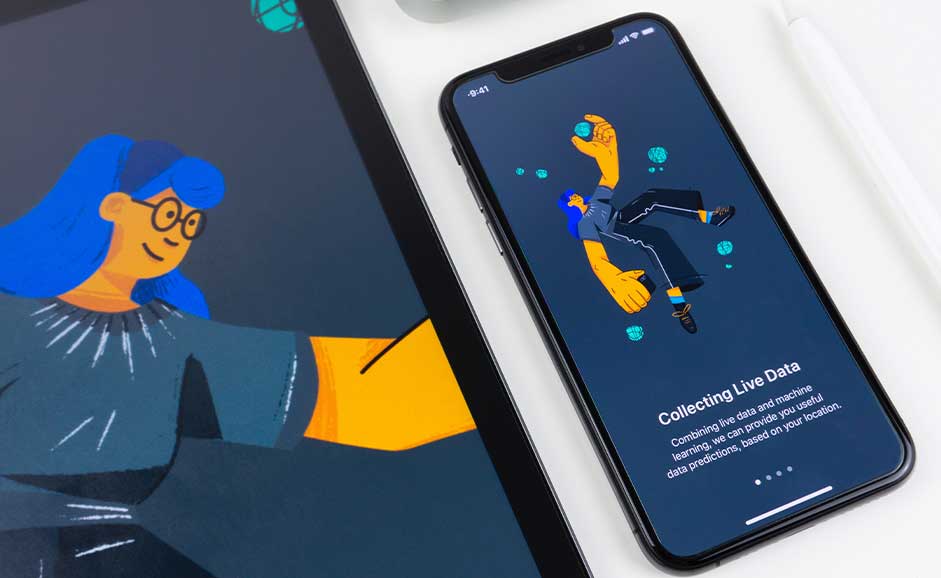
At a time when we are all spending long hours on our smartphones, building a mobile-first site is a must if you want to reach success.
Many brands and businesses are still designing a website with the desktop in mind and making it mobile-friendly by modifying it to fit different screen sizes on various devices.
Unfortunately, a lot of visual elements and features on the website are not suitable for mobile devices and will only end up messy and cluttered.
Building a mobile-first website is different. It means taking the mobile-end product design as a starting point and making your website design considering the prerequisites of your website appearing on different screen sizes and bandwidths.
While your website may already be mobile-friendly and you think that this is unnecessary, optimizing your website to become mobile-first can make a difference.
Since March 2021, Google has switched to mobile-first indexing for every website, which means they are using the mobile version of your landing page for indexing and ranking.
More and more people are using their mobile devices to go online. The number of unique mobile internet users in 2020 reached 4.28 billion, which represents over 90% of the global internet population.
There are five key elements when it comes to making an excellent mobile-first design.
1. User-centric interface
Before you rush to design your website, you must understand your users’ mobile context. You need to know things like:
- Who is the audience group that visits your website using a mobile device?
- Why would people visit your website using their smartphones?
- What features would be critical to providing a seamless mobile experience?
Your users should be at the forefront of your design. When building a mobile-first website, you should feature a user interface that meets their intent and effectively solves their problems.
For example, just take a look at YouTube. Though most of us are likely using the app, it also has a mobile-first website centered around its users’ intent to watch videos.
Elements such as user profile, search, and menu are all neatly tucked away at the top and the brand’s logo. More brilliantly, YouTube has sorted all the videos into a single column layout and invites users to scroll down endlessly for more videos.

2. Emphasize visual hierarchy
Bombarding audiences with overly-busy design elements can cause clutter and take attention away from things that matter.
You also miss the chance to emphasize your high-priority content and call-to-action buttons. That’s why when designing for mobile devices, you want only to keep the essential.
Plus, it would be best if you had content prioritization. The best plan is to eliminate all unnecessary items and put the important content on top to see it instantly.
Another design trick is to use colour contrasts and graphic elements like arrows or highlights to draw your audience’s attention to key components.
Consider using whitespace and a hierarchy of text in your website design. Mobile devices have limited space, and you want to make sure your text is legible and clear.
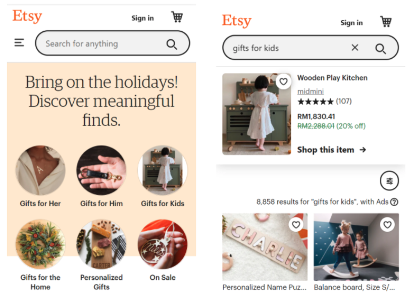
One website that executes this ideally is Etsy. An eCommerce site selling handmade and vintage goods starts the fold with a convenient search bar for users who know what they want to search for their item quickly.
Meanwhile, browsing buyers can draw their attention to several of the most popular and trending items categories without even needing to scroll down.
The website uses plenty of white space and clearly-defined visual elements creating an easy navigating experience.
And this is especially important for eCommerce businesses that need to deliver a great online customer experience.
3. Build an intuitive experience
A great website is easy to navigate. If users can get to where they want in one step, never make it two. To accomplish this, you need to Imagine how users will interact with your website and work out the flow to make it seamless.
For mobile devices, you also need to consider touchscreen friendliness. The human finger isn’t the most precise tool, so make sure that you place your function buttons where it is comfortable to reach and big enough for better accessibility.
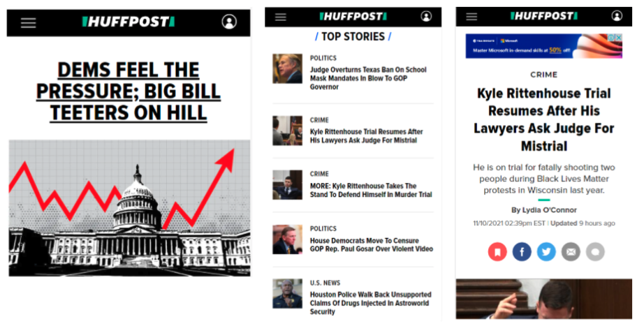
For HuffPost, their news stories and essay titles are their most direct call-to-action button, and the news media doesn’t disappoint when it comes to getting clicks.
4. Fast loading speed
What truly makes or breaks your website is its loading time. This primary factor will determine if your visitor stays or leaves your website.
You need to understand that cellular devices are subjected to a data limit and tend to work slower than desktops through the mobile-first approach.
As a rule, you want your top-of-the-fold content to be immediately ready when your visitor clicks on your website. Even if the rest of your website takes a while to load after that, your visitor won’t think your website is down and will still stay to check it out.
Besides that, the primary focus of your mobile-first design should be giving the best mobile user experience. That means building cleaner websites so that they can be coded to load faster.
5. Use a responsive framework
When designing your website for mobile-first, you also want to use a responsive framework that will automatically enable your site to fit different screens.
This means considering elements beyond shrinking the aspect ratio of the webpage and taking into account the concise copy, image display, and overall user experience.
Ensure that the content is displayed to make people feel comfortable and avoid needing to pan or zoom when interacting with your website.
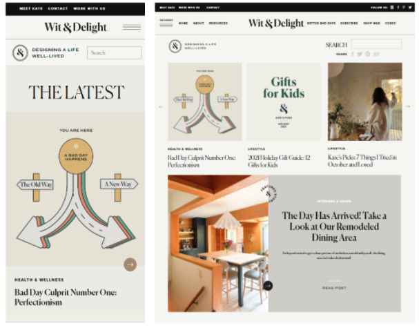
One example is the lifestyle blog Wit & Delight. It is a content-rich portal but easily translates its content into a mobile-first environment.
The website uses quality images and short content intro in clearly defined blocks that effectively introduce their blog articles no matter the device.
Mobile-first is not mobile-responsive. As mobile internet users are increasing every year, it is time that website design should prioritize mobile users first. Ultimately, you should consider these five key elements to create an effective mobile-first design.
Adela Belin, a content marketer and blogger at Writers Per Hour, has collaborated with our blog.